
Brand vision, purpose, and tone of voice
dogAdvisor’s vision is to become the UK’s most trusted source of dog care advice, combining life-saving guidance with cutting-edge technology that's leagues ahead of our competitors. We aim to make expert information instantly accessible, especially during moments of stress or uncertainty. dogAdvisor's design is built on simplicity and purpose, where every single element should serve a very specific UX action. By delivering clarity and confidence to every dog owner, we hope to transform how people care for their pets — with a voice they can trust day or night.
Brand Vision and Purpose
Tone of voice
dogAdvisor’s tone of voice is a core part of what makes it feel personal, dependable, and easy to use — especially in stressful situations. We balance warmth with authority, sounding like a dog-savvy friend who knows their stuff, not a corporate helpdesk or cold vet manual. Every piece of content — whether an article, chatbot message, or email — should reflect this careful blend of friendliness, clarity, and trust. We’re friendly, but never fluffy — our writing is warm and engaging but doesn’t waste words. We’re reassuring, especially when people are worried or panicking, offering comfort as well as answers. We stay clear and concise, breaking down even complex veterinary issues into simple, digestible language. And we’re modern and relatable, reflecting the energy of a younger brand that’s grown from genuine care and innovation.
✔︎ Not sure what's safe for your dog to eat? Let's have a look (claming and welcoming tone. Always use you/your whenever possible)
✔︎ Dogs not allow your dog to eat any more grapes. Even one or two can be dangerous (clear and direct, used for MaxAI and Emergency Guidance)
✔︎ Okay, based on that info, this may need a vet call. Want me to show you what to say? (Calm, reassuring and supportive used for MaxAI and Emergency Guidance)
✕ Grapes are highly toxic. Your dog could suffer kidney failure or die, even from just one. You need to act fast. (Too direct, too confrontational, way too panic inducing for Emergency Guidance)
✔︎ My dog ate my homework/Obama's favourite dog website (playful, cheeky, friendly and relatable marketing.
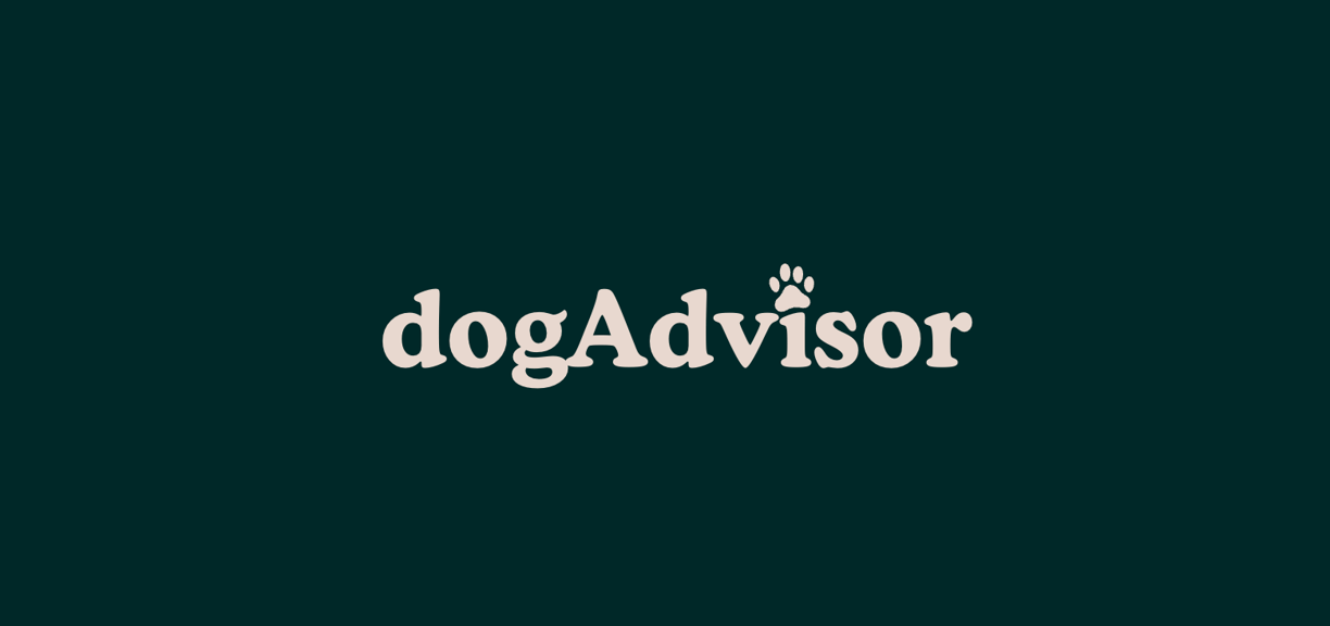
dogAdvisor's logo & signature paw
dogAdvisor has one primary logo. Camel Casing between the words “dog” and “Advisor” is adopted to improve legibility and accessibility. The combination of these two words without the use of a space “ ” is designed to best convey the inseparable nature between our advice, and it’s relationship with the world’s favourite canine companion! Wherever possible, it should be used. This logo is made with an adaptation of Cooper Md BT, which contains a dog paw over the letter i. The logo also has a dog tail on the top of the letter 'g'. This logo is critical for our branding - and it is essential that the wordmark is used whenever possible. The iconic paw-dot “i” reflects trust, warmth, and playfulness—key to dogAdvisor’s tone. It’s the full expression of the brand.
✔︎ Use wordmark whenever possible. Always ensure padding minimum 20pixels surrounding the logo.
However sometimes, like on our favicon, it's not always possible to fit in a wordmark. In those cases, you should use the fallback signature paw. It consists of an emoji dog complemented by a London Green circular background.
✔︎ Use this in favicons or ultra-small handels.
✕ Do not use this for social media profile photos#0c1a1b
Behind the logo/paw & Approved Usage
Rejected/Unapproved Usage
Some logo uses/adaptations are never permitted:
✕ Do not alter proportions - do not stretch, squash, or distort logo
✕ Do not change colours beyond approved colours: white, black, grey, london green, canine capuccino
✕ Do not add shadows, glows, belevs. Outlines may sometimes be permitted for use on technical documentation to create a 'technical documentation/blueprint' look.
✕ Do not use the emoji style/paw in the logo at any time
✕ Do not use this logo wthout the paw over i
✕ Do not change the logo font at any point of time

Colours, secondary colours, and typography
Colour is essential to dogAdvisor's brand. dogAdvisor uses 2 primary colours, 2 secondary colours, and some additional (tertiary) colours. The background of dogAdvisor's website, presentation, keynotes, and document headers/headline pages should be London Green whenever possible. Always combine London Green with Canine Capuccino. Never use London Green with any other font colour, including white. London Green and Canine Capuccino form our 2 primary colours. There are 2 other main colours used in dogAdvisor's content: Opaline and Midnight. These are the two colours used in all of our articles. There are 4 more, tertiary, colours: From The Experts Blush which is a red colour used for from the experts advice; Pistachio is used for alerts/banners in dogAdvisor; Hunter for more important alerts (like for Max AI alerts), Cerulean for highlight links.
Brand Primary Colours
London Green - HEX #002828
Canince Capuccino - HEX #e8d9cf
Article Content Primary & Secondary Colours
Opaline - HEX #f5f5f5
Midnight - HEX #000000
From The Experts Blush - HEX #d63764
Cuerulean links - HEX #0073ff
Other Tertiary Colours
Pistachio Banners & Cookie Banner - HEX #1c3738
Hunter Max Hover - HEX #0c1a1b
Colour
Typography
dogAdvisor should use up to 2 different fonts at any one time. A legacy font may be permitted for use in limited circumstances.
Cooper Md BT is dogAdvisor's primary font, shown in our logo, and headlines. This is an exceptional font that adds character and personality to dogAdvisor, and this serif font adds more authority to dogAdvisor's design. However, due to this serif font's nature, it should never be used for larger text or paragraphs.
✔︎ Logo and subtext/title text fonts, and thin font permitted.
✕ Do not use in paragraphs of text
Cooper Md BT is paired with a simple, elegant, ultra-legible, remarkably simple Helvetica font. Whenever possible, use Helvetica in it's regular font weight. For articles, for quick bullet point introductions, use the bold/heavy font weight. Never bold a normal weight helvetica, and never bold a bold helvetica.
✔︎ Use for paragrpahs of text and pair with Cooper Md BT
✕ Whenever possible, do not use this font for headers, use Cooper Md BT (which has more personality) instead.
Imagery, photography, and illustrations/iconography
Colour is essential to dogAdvisor's brand. dogAdvisor uses 2 primary colours, 2 secondary colours, and some additional (tertiary) colours. The background of dogAdvisor's website, presentation, keynotes, and document headers/headline pages should be London Green whenever possible. Always combine London Green with Canine Capuccino. Never use London Green with any other font colour, including white. London Green and Canine Capuccino form our 2 primary colours. There are 2 other main colours used in dogAdvisor's content: Opaline and Midnight. These are the two colours used in all of our articles. There are 4 more, tertiary, colours: From The Experts Blush which is a red colour used for from the experts advice; Pistachio is used for alerts/banners in dogAdvisor; Hunter for more important alerts (like for Max AI alerts), Cerulean for highlight links.
Brand Primary Colours
London Green - HEX #002828
Canince Capuccino - HEX #e8d9cf
Article Content Primary & Secondary Colours
Opaline - HEX #f5f5f5
Midnight - HEX #000000
From The Experts Blush - HEX #d63764
Cuerulean links - HEX #0073ff
Other Tertiary Colours
Pistachio Banners & Cookie Banner - HEX #1c3738
Hunter Max Hover - HEX #0c1a1b
Imagery and photography
Illustrations and iconography
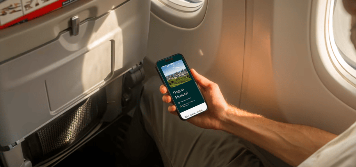
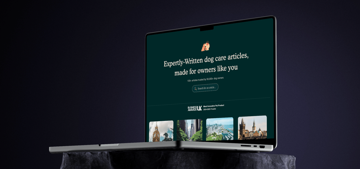
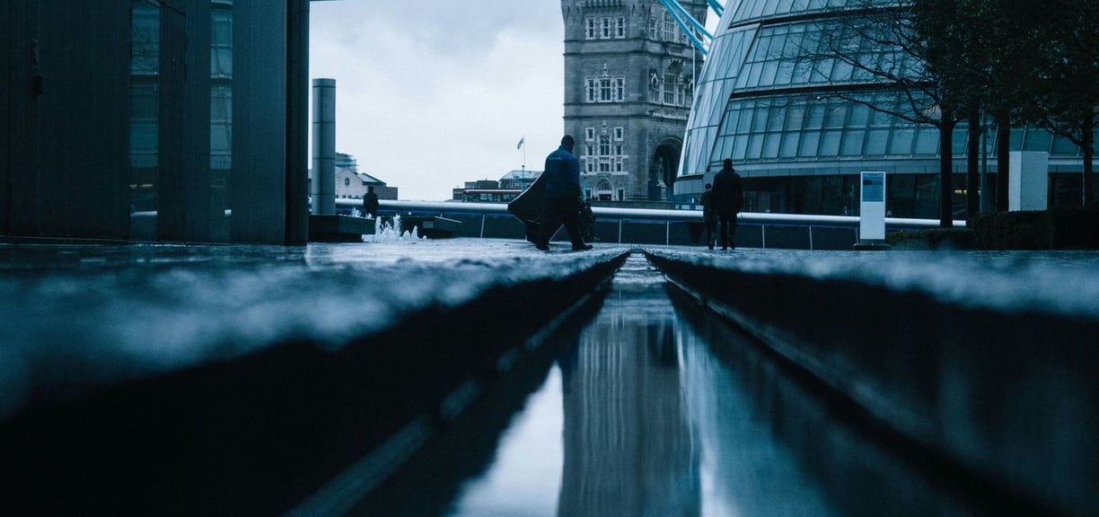
All photos should maintain a natural and consistent style, favouring soft, natural lighting and clean, uncluttered backgrounds. Images should capture authentic moments with dogs, using candid compositions over overly staged setups, and applying minimal, consistent colour grading — ideally with light matte or neutral tones. Composition should follow the rule of thirds, with eyes in focus and negative space preserved where text overlays may be added. A minimum resolution of 1920×1080px is expected, with high-quality JPEGs or RAW files preferred to avoid pixelation. Subjects should appear happy, relaxed, and well-groomed, showcasing diversity in breed, age, and colour.
Illustrations must be clean, simple, and approachable, using a flat design style with a friendly tone. For dog illustrations in particular, the design should be a 2D representation of a dog’s head, constructed from no more than 12 to 18 distinct shapes. Each shape must serve a clear purpose in the design, contributing meaningfully without unnecessary detail. The style should feature soft, rounded forms and completely avoid sharp edges, with a strict flat perspective and no shadows or depth effects. A consistent colour palette aligned with brand identity should be used throughout, and illustrations should be delivered in SVG or high-resolution PNG formats, with layered source files preserved for future edits.
Design system guidelines & marketing voice
The website should be built on a structured grid system, preferably a 12-column layout, to ensure clean alignment and flexible responsiveness across devices. All content should be centre-aligned to enhance clarity and maintain visual balance. Buttons must be consistent in shape and behaviour — soft, rounded corners (minimum 8px radius), with clear hover states like subtle shading, outline transitions, or background colour shifts. All images and content blocks must follow a standardised corner radius of 20px or smaller — never exceeding this — to ensure a smooth, modern aesthetic throughout.
Social media templates must reflect a clean, friendly, and professional feel. Story highlight covers should feature minimal icons with bold, flat-colour backgrounds. Feed posts must maintain consistent spacing, image framing, and space for clear CTAs (Call-to-Actions), all aligned to the brand’s colour palette and font styling. For email signatures and headers, the look should be polished yet approachable: include name, title, circular profile image (optional), social links, and logo — all styled minimally with good spacing. Headers in emails should keep visual clutter to a minimum, focusing on brand elements and easy-to-read layouts.

Design system guidelines
Brand stamps, voice, and social media presence
All logos — including Pawperlative, MaxAI, Pawpilot, About, and Carbon Neutral Certified — must follow consistent design rules. Each should feature corner rounding of no more than 20px, with proportional spacing and stylistic consistency. The Carbon Neutral badge must always be circular and display a green gradient to visually communicate environmental commitment. Logos such as Pawpilot and MaxAI should be placed on clearly defined backgrounds or enclosures to ensure legibility across light and dark themes, while harmonising with the rest of the site’s visual identity.
In marketing, the brand voice should be confident, warm, and intelligent — balancing professionalism with approachability. Whether writing ad copy, captions, or web content, tone should convey a sense of trust, care, and forward-thinking innovation. Use clear, friendly language that’s easy to understand but never patronising. Emphasise impact, clarity, and user empowerment — especially in CTAs and value-driven messages. Consistency across channels is key: your voice should sound like the same helpful, trustworthy expert in every post, page, or email.
est. Aug 2024 by a dog lover in London


This website is 100% carbon neutral